Form Controls
Each item or element included in a Form is known as a Control in Bizagi.
Elements are added onto the form individually by means of drag-and-drop from the Left panel of the Forms Designer. They can be added in one of two ways:
- Add the attributes directly from the data model located in the Data tab.
- Select a control type element from the Control tab and then associate the attribute.
When an attribute or control type element is added to a Form, it is interpreted by Bizagi and becomes a Control.
Each Control originating from an attribute element has a type: text, Date, Combo (drop-down list), Yes/No, Number, etc., based on the attribute type. Controls originating from control type elements (Control tab) will merely inherit the control type. Examples include Money, Text Box, and Search control types.
To delete a Control, select it and click the Delete icon ( ) attached to the boundary of the control.
Selecting Multiple Controls
You can select multiple controls by selecting them while holding down the Ctrl key. The options that can be applied to multiple controls at a time will be displayed on the left panel.
To delete multiple controls, select them and then press the Supr key.
By default, each control is visible, editable, and optional in Bizagi.
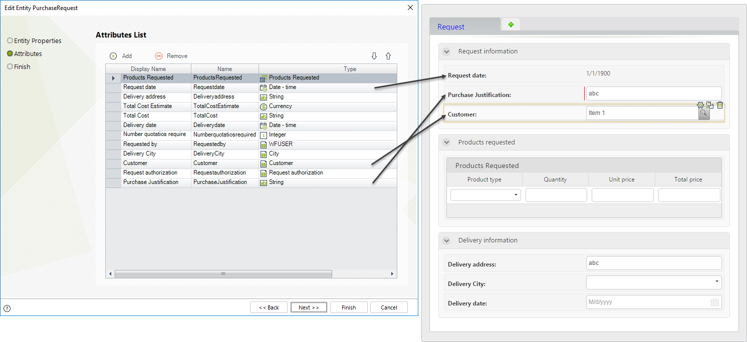
Add an Attribute onto a Form
Data model attributes are included in the Form from the Data tab. When an attribute element is added onto the Form (Display area), Bizagi interprets it and allocates a type to the resulting Control.
Bizagi identifies the most appropriate graphical display of the data and selects the control type accordingly. You are able to change the control type to better suit your needs.
Each attribute included in a Form will become a Control and have a specific control type. Bizagi will automatically maintain the reference to the original attribute.
For example:
- The Request date attribute has a Date-time type. It is included as a Date control in the form.
- The Purchase justification attribute is of type String. It is included as a Text box control in the form.
- When adding a related entity (collection) attribute like Customer, it will be included as a Search control to enable end users to search for the relevant customer.
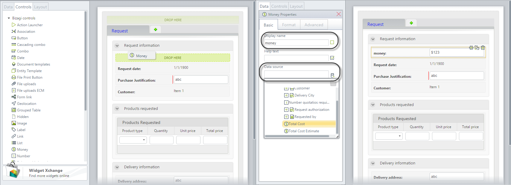
Add a Control onto a Form
The Control tab (in the Left panel) contains various control elements for inclusion in the form. The resulting control will inherit the type of the control element chosen, but it WILL NOT HAVE A REFERENCE TO THE DATA MODEL. Controls in a form must have a reference to the data model, and this reference is referred to as the Data Source.
When a control element is dropped onto the Display area, its Properties window will open on the left. Give it a correct Display name and select a Data source referencing the correct attribute of the data model.
Control Types
Bizagi offers a set of default controls that you can use to create almost any kind of desired form. If you need a more complex control, you can build one of your own and extend the form's functionality using Widgets.
| CONTROL | DESCRIPTION |
|---|---|
| Action Launcher | This control presents all Actions defined for a specific entity. The control will only display the available Actions for the Stakeholder. |
| Association | This control is used to handle Multiple-Multiple relationships. Allows relating values from one collection to one or more values of another collection. |
| Button | Is displayed in the Work Portal, and when you click on it, the related expression or interface will be executed. |
| Cascading combo | Presents two or more combo boxes working in conjunction with one another, prompting end users with only the relevant data. |
| Combo | Presents a drop-down list that displays a set of values. Only one item can be selected. |
| Date | Shows a calendar. Times can be included if defined. |
| Document template | Defines and generates documents in PDF format containing information of the Process. |
| Entity template | This control displays the Template defined for a specific entity, for the Stakeholder. |
| File Print Button | Allows printing multiple files related to a case, all at the same time, with just one click. |
| File uploads | Enables end users to upload files. Each File attribute is handled as a collection to associate multiple files with the attribute. |
| File uploads ECM | Enables end users to upload and attach files to the application, and have them stored directly in an ECM repository. |
| Form link | Provides a link that redirects the user to a different Form. |
| Geolocation | Displays the exact location of the end user in latitude and longitude, in mobile devices. |
| Grouped table | Presents a table that relates to a Collection. The main difference with the Table control is that records can be grouped according to values of one or more of its columns. |
| Hidden | Allows an attribute to be included in a form but not display to the end user. For example, when implementing Actions and Validations. |
| Image | Enables the upload and display of images. |
| Label | Presents fixed text strings with no relation to the data model. |
| Link | Presents a link that redirects to a URL (intranet or internet). |
| List | Lists all values of a specific entity. It allows for only one choice. |
| Money | Displays currencies. |
| Multi Select | Allows the end user to relate multiple records of one entity (entity B) to another one (entity A). |
| Number | Displays numbers. |
| Polymorphic Launcher | This control displays all Actions according to the inheritance defined for the parent entity, in a tree-like structure. |
| Radio | Enables the user to select exactly one item from a short list |
| Record View | Presents records of a collection individually, in an embedded form that contains detailed information about each single record. |
| Search | Allows searches over entities based on one or more attributes keys. A related window displays for end users to enter the search criteria and return results. |
| Search list | Allows the end user to relate multiple records of one entity (entity B) to another one (entity A). |
| Suggest | Searches over an entity and proposes a data entry as the user types the text. These auto-complete suggestions use the data source associated with the control. |
| Table | Presents a table that relates to a Collection. The table must contain at least one column for display. |
| Text box | Presents a user interface where the user can enter text. |
| Yes/No | Displays a Boolean attribute for the end user to select between Yes and No options. |